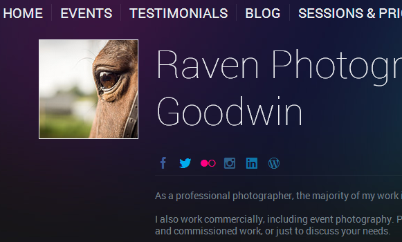
A user on Reddit who has a photography portfolio site for her equestrian, portrait, and event photography business asks:
“Can you help me please? I would love some tips on how to improve my homepage on my website to increase customer engagement and reduce bounce rate…”
So here’s my answer on how to decrease bounce rate, increase user engagement on a photography portfolio website.
Don’t Make the Visitor Think
If the visitor has to think – even for a second or two – about your website or landing page, they are more likely to bounce. So part of decreasing bounce rate and increasing user engagement is not making the visitor think. There is an incredible book about this approach to web design, but the summary is this:
Your website, landing page, and homepage should instantly answer these questions in an obvious way that doesn’t make the visitor think even for a few milliseconds:
- What is this?
A photography website for a photographer that shoots horses, portraits, and events. - What can I do here?
Look at a portfolio/gallery, check prices?, contact photographer - What do they have/are they selling here?
Photography of horses, portraits, and events. - Why should I be here and not somewhere else?
Answer this with awesome photos, which you have, BTW. You are the obvious best choice if someone needs a horse photographer, and especially if they are doing an event that involves horses, and portraits. This is where bragging and name-dropping about events or famous horses or boarders or organizations you’ve worked with comes in handy. - What do I do next?
This is where your site could use some help. You need to have a BOLD Call-to-action – a ‘big green button’ (doesn’t necessarily need to be green) that makes it obvious what you want your visitor to do next. Get really specific and focused about the ONE thing you want them to do. Call you? Email You? What is the end goal for this? Make it obvious. You may have intermediate steps in there, like ‘View my work’ first, but it should be obvious on every page of the site what your call-to-action is.
The good news is that you seem to be concerned about your analytics, which is great.
Customer engagement is about giving them something to do, and decreasing bounce rate is about making it dead simple and idiot-proof obvious where to click next or what to do next (see #5 above) So give them something to do. Spell it out in nice easy steps for them like they are 3 years old
- Visit My Gallery to Check out my Work
- Like what you see? Contact Me.
- I’ll get back to you right away
- I’ll shoot your/horses’ portraits and they’ll be awesome.
In looking at my analytics for my wedding photography site, I checked my ‘All Traffic’ report in Google Analytics and saw that the most visited sections of the site were:
- My Gallery (look at my work)
- My Pricing Page (check out my prices)
So I actually rearranged my navigation to make those the first items, in that order.
TLDR: Get BOLD and treat the visitor like a 3-year old.

